What’s New in Interior Design in 2018
The two big words in interior design for 2018 are authenticity and personalization, says Leigh Spicher, national director of design studios at home builder Ashton Woods, the Atlanta-based home builder that is building in Sarasota in its new-home enclaves of Hammock Park, Palmer Park and Whitaker Park. And those all-white kitchen cabinets we’ve come to love—changes afoot there, too.
We caught up with Spicher while she was attending the NAHB 2018 International Builders’ Show in Orlando in January, sharing ideas on current home trends with some of her fellow 85,000 attendees.
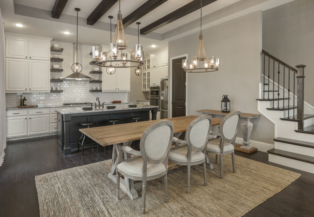
Ashton Woods' Curtis model in Dallas displays the authentic textures homeowners are opting for from hand-scraped hardwood floors to incorporating textures with the table, staircase railing and open shelving.
Image: Courtesy Ashton Woods
“Homeowners are not so inclined to be perfect anymore,” Spicher told us. (Whew!) “They’re embracing natural character and authentic textures in their home.”
For example, she says: “People seem to be having a desire for authentic finishes—away from smooth maple cabinets and glossy floors with any character mark in them toward a hand-scraped wood floor, or trim that has a notch in it or a character mark you can see in the wood. We’re back to embracing the natural beauty of things. Even oaks and hickories are coming back in flooring, doors, millwork; a lot of authentic texture.”

Ashton Woods' Haines model in Orlando displays how to incorporate those pops of color, such as the Pantone Color of the Year, Ultra Violet.
Image: Courtesy Ashton Woods
Personalization is in, too. “Pantone’s color of the year is Ultra Violet, which is pretty tough to incorporate into the home unless you consider it as an accent,” she says. “But it does illustrate the trend of ‘anything goes.’ It’s all about, ‘I personally like this and I’m going to put this in my home.’” Bottom line, says Spicher: “You can make your home uniquely yours.”
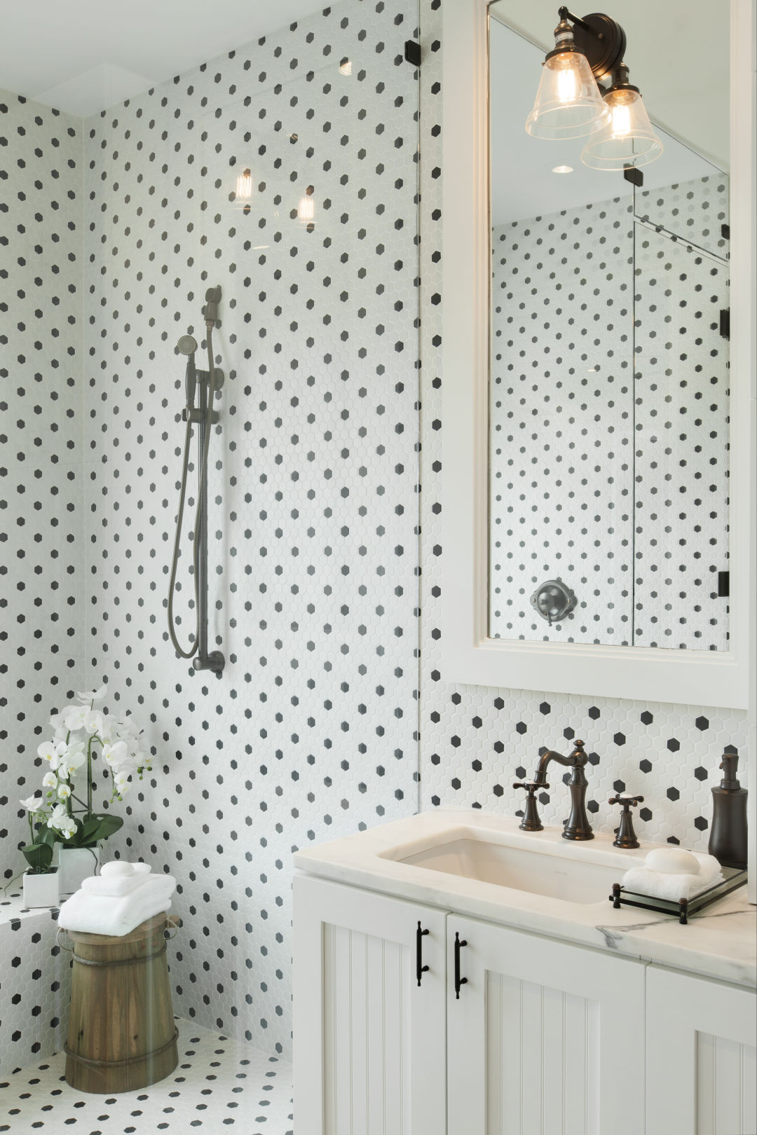
The Schooner model in Tampa show how homeowners are incorporating the bold black and white tiles in the bathrooms.
Image: Courtesy Ashton Woods
Florida is a big tile market, and Spicher has taken note of some interesting things happening. “I’m seeing a bolder black-and-white tile pattern, the retro 1940s, ’50s harlequin floor tile, making a comeback, primarily in the bath,” she says.
The Addison model in Atlanta displays the new Wellborn cabinet line, displaying the “new neutral” we’re seeing as homeowners stray away from the all-white kitchen.
Image: Courtesy Ashton Woods
And those all-white cabinets in the kitchen and bath that everyone embraced? The trend in 2018 instead is toward what she calls “new neutrals.” Ashton Woods’ cabinet manufacturer, Wellborn, has a finish Spicher says is particularly suited to the Florida market: oatmeal charcoal. She describes it as “the creamy color of oatmeal with a cool gray tone on top of it. Then you can use big bold pops of color on top of that.”